lunes, 30 de agosto de 2021
WEDNESDAY SEPTEMBER 1ST- 2021 GRADE 10B -SALE AND MARKETING
miércoles, 25 de agosto de 2021
TUESDAY 31TH AUGUST- GRADE 11A - E COMMERCE STEPS
Qué infraestructura requiere una e-commerce detrás (offline)
Aunque el fin primordial del e-commerce, son las ventas en línea, el hecho de contar con una buena infraestructura offline detrás, se vuelve un factor prioritario para una verdadera operación eficiente, capaz de competir en este mercado cada vez más disputado. Aquí te hacemos una síntesis con los elementos básicos a tomar en cuenta.

Dirección de e-commerce
De entrada, es importante tener una buena organización, que permita definir funciones de forma adecuada; así como diseñar y optimizar de forma constante las estrategias. En ocasiones se le conoce como un e-commerce manager, que puede ser una persona u oficina, capaz de organizar de forma apropiada el plan general para el mejoramiento constante de nuestro sistema de comercio en línea.
martes, 24 de agosto de 2021
miércoles, 11 de agosto de 2021
WEDNESDAY AUGUST 18TH -GRADE DECIMO A SYSTEMS-LOGOS STYLES
https://www.thelogocreative.co.uk/10-best-tech-companies-logos-their-analysis/
ACTIVITY -READING
1. Escoger la descripcion de alguno de los logos dados ( HAY 10 ) y usarlo en la descripcion de logo creado
LINK https://www.thelogocreative.co.uk/10-best-tech-companies-logos-their-analysis/
Top 10 Tech Companies Logos
With a variety of tech companies out there, it would be hard to pick the best logo. However, we have prepared a list of 10 great ones for you to learn from.
Let’s take a look.
1.Apple
Apple is probably one of the most recognizable logos in the world. It perfectly reflects the idea of the logo’s simplicity – it is distinguishable and carries the company’s name.
However, Apple’s logo has not always looked the way we are used to it. Back in the day, it had nothing to do with apples and looked like this:
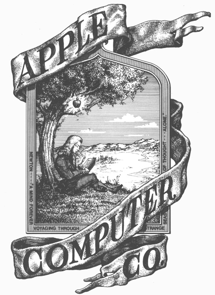
It was created by one of Apple’s founders, Ronald Wayne, and even though it represented the values of the company, gave little to no understanding to the customers about the company’s products.
Everything changed in 1977 when Rob Janoff presented the concept of the logo that looked almost just like the one we are used to seeing now.
The new logo has been so well received that it’s shape has not changed since then. A well-spent web designer salary, we must say!
2.Grammarly
One of the most successful Ukrainian startups, Grammarly sure has a distinctive logo. It was initially created to help people communicate more effectively.
Now it is a powerful tool that can check your spelling and grammar as you type.
As for the logo, the founders decided to go with the green color for the logo as it mostly represents growth while causing a somewhat calming effect.
The white arrow represents the letter “G” and the button that activates Grammarly in Google Docs and other similar applications.
Just like Apple, Grammarly decided to go for a simple design, rather than over-complicating the logo.
At the same time, the designers managed to make it look gripping, catchy, and memorable for the audience.
3.Allset
The mission behind this startup was to try and make people’s everyday lives easier. Allset is a platform that connects people with local restaurants, offering them fast and easy pick-up services.
It works easy, all you have to do is to order the meal before you arrive at the place.
Their logo follows the idea of business perfectly – it is catchy and memorable. Generally, all logos with smiley faces evoke the feeling of happiness.
This one, however, stands out from the rest – it has the third eye! That is the kind of feature that will attract everyone’s attention.
4.Mobilunity
In the Ukraine web development outsource industry is big and Mobilunity is an important part of it. One of the biggest Ukrainian outstaffing companies decided to make a whale their logo symbol.
The metaphor behind this choice is beautiful – just as the whale feels equanimous in the ocean, Mobilunity is feeling free and confident on the market.
The whale’s fountain reflects a variety of solutions Mobilunity has to offer to its clients. The symbol itself is meant to be friendly and customer-oriented.
As years passed by and the company grew in size due to its lowest web development cost in Ukraine, the logo changed its appearance as well.
The new polygonal style looks modern and fresh, perfectly projecting the company’s core values.
Such attention to detail surely made its impact on the Mobilunity’s popularity on the Ukrainian market of web development outsourcing services.
5.URSA
Ursa is a satellite intelligence company that is based in the USA. Its core mission is to provide analytical solutions to government executives.
Even though their logo is a rather typographical one, it perfectly resonates with their mission and values.
Dots around the company’s title resemble the Ursa Major constellation while also pointing out to Ursa’s use of satellites.
This logo is simple yet unusual, attracting everyone’s attention. As a result – people easily memorize it. Ursa’s logo design is being followed by its website as well.
You can easily find similar dots all over it. Such dedication in setting up a brand’s image can only be admired.
6.BlackBerry
BlackBerry is easily one of the most famous tech and IoT companies in the world. Without a doubt, it is the one people can recognize just by looking at the small portion of their logo.
Despite all the ups and downs the Canadian multinational company had throughout the past years, you can barely find a person who has never heard of this iconic tech giant.
Back in the days, the company produced famous smartphones and tablets that stood out from the crowd and were full of tech innovations in the era of early “smartphones.”
Similar to Apple, BlackBerry’s company name has nothing to do with the industry or the products they manufacture.
Although, if you remember the way their phones looked, there’s a slight resemblance to the logo.
Often, people compared the blackberry seeds to the keys on the phone, which were, as a matter of fact, always blacked-out.
Has it been done on purpose, or is it a pure coincidence?
7.Adobe
 Adobe Systems, Incorporated is a software company from the USA, headquartered in San Jose. The company is famous because of a family of graphic design applications that it has created and keeps on upgrading every year.
Interestingly enough, they have changed the logo only once, back in 1993. The uniformly simplistic approach to logo designs and the corporate logo, in particular, is what makes this company instantly memorizable.
The same outlook is observable throughout the company’s products’ logos. One can’t mix up Adobe with another company, and that is why it’s on our list.
8.October
The French-born FinTech startup has recently secured a huge investment due to its unique market positioning and the solution they offer.
The mission of October is to empower businesses to thrive by simplifying and democratizing their funding. The company creates an efficient link between lenders and companies.
One thing that is also efficient and simple is the company’s logo. It speaks for itself, no, literally. It’s a kind of a logo that tells you precisely what you want to know – the company that represents it.
What makes it unique is the icon you see on the left. Whether it’s a leaf falling from a tree at the end of October, or a high-flying bird, which the company is; maybe a stylized image of a heart.
Every option has its meaning and connection with the brand’s values.
9.Salesforce.com
American company by origin, Salesforce.com has developed one of the biggest CRM systems in the world, provided to customers exclusively on the SaaS model.
It’s one of the most popular CRM systems that exist in the modern era of cloud computing and emerging technologies.
The idea behind the logo is so simple, yet gives a clear understanding of the company’s positioning, the solution they offer, and the way things are built and meant to be working.
The logo’s simplicity is visible to the naked eye. But it’s a powerful combination of clean design and perceivable brand identity, which results in an instantly recognizable logo.
10.Cisco
Last, but not least, let’s take a closer look at the logo of a multi-billion-dollar company from California – Cisco. This US-based company specializing in hardware and software for networks sure has an interesting story behind their logo.
Since its creation in 1984, the Cisco brand and its visual identity have been a subject of numerous changes and dozens of iterations.
The trademark of one of the most influential IT companies in history is a mere tribute to the city where the enterprise was born and a reflection of the founders’ value of their roots and legacy.
The company was named after the city of San Francisco, which is also called “Cisco.” If you take a quick look at the original logo, there’s clear evidence to this fact – the Golden Gate Bridge.
The logo is an eye-catcher and gives a strong association with the company’s global image.
Final Thoughts
Creating a logo that works is no easy job, that is for sure. In many ways it could be described as the face of the company.
If you think about it, the logo is the first thing potential customers see when they get familiar with the company.
It is not just an image, as some might think. It is an element of recognition for your customers, and a core element of your branding.
People often form their opinion about something during the first few minutes, if not seconds.
Your logo in this situation might be the very thing that will win you a loyal customer.
If you take a closer look at all these examples that we gathered for you, you will see that they have a few features in common. One of them is simplicity.
There is no point in overwhelming your customers’ perception with a complicated logo. The simpler it is – the higher are the chances that people will remember it.
The second factor is creativity – it is important that you show your company’s message in the simplest way possible. Just remember, that a good logo is the easiest way to win new customers.
WEDNESDAY AUGUST 11TH- GARDO DECIMO B -COLOR EMOTION GUIDE
IMAGEN EXTRA
WEDNESDAY AUGUST 11TH GRADO 10 A
TUESDAY AUGUST 1OTH GRADO 11B AGRO
TUESDAY AUGUST 10B TH HEALTHY LIFESTYLE
TUESDAY AUGUST 17TH- GRADO ONCE A SYSTEMS- MENTAL HEALTH
AVTIVITY
Observar las siguientes imagenes donde encontrarán algunos TIPS de un Estilo de vida saludable cuya combinacion de BUENOS HABITOS,alimentacion sana con tecnologia nos ayuda a llevar un mejor estilo de vida y bienestar
martes, 3 de agosto de 2021
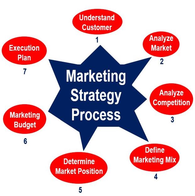
TUESDAY AGOSTO 3-GRADO ONCE B -AGRO-MARKETING PLAN
ACTIVITY
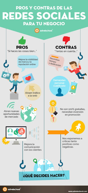
1. Sacar el listado de conceptos con su traduccion de las siguientes imagenes.
TUESDAY 3 AUGUST 2021- GRADO 11 A SYSTEMS


